Axure on a mobile device
- Amit Daliot
- Mar 14, 2012
- 2 min read
In this post I would like to share with you the way I structure the Axure sitemap to best support a mobile design. My targets are:
Be able to test and share the prototype on a real mobile device – making it behave as close as possible to the real thing.
Clearly define the set of pages required and the transitions involved.
Easily maintain the project
How to build the Axure sitemap
Its all about the iPhone body image. The idea is to show it when you are testing the prototype on a PC screen but to hide it when you are testing the prototype on an iPhone browser. One easy solution for that is to use the Axure inline frame (iFrame) widget. You can find it in the standard “wireframe” library as well as the “beter defaults” library. A widget not commonly used but most powerful. iFrame widget allows you to allocate inside your page, a different web page. So you can design a static page which has a framed area within which is dynamic and totally taken from your other pages. Going back to our goals, we will define a main page which has only static elements – the iPhone body, the top indication bar (the one with the network and battery indicators. unless your prototype operates on these elements as well). This is also the place to put sidenotes for programmers.

And we will create the application home page in a child page. This page should reside inside an imaginary box boundaries the size of the visible area in the iPhone screen.

* Note that in the above sample I used Axure guides. These thin lines helps you border your design area with specific dimensions. Smply drag them from the main wireframe pane left border and from the top border.
Now we reach the part where the inline frame is to be used:
Drag the inline frame widget into the visible/dynamic area of the iPhone body.
Resize it to fit the visible design space – usually 320×356 pt (click here to see UI elements sizes )
Select “Never show scrollbars”
Edit the “default target” web page to point to the child home page that you previously created.

How to access the prototype from the iPhone browser?
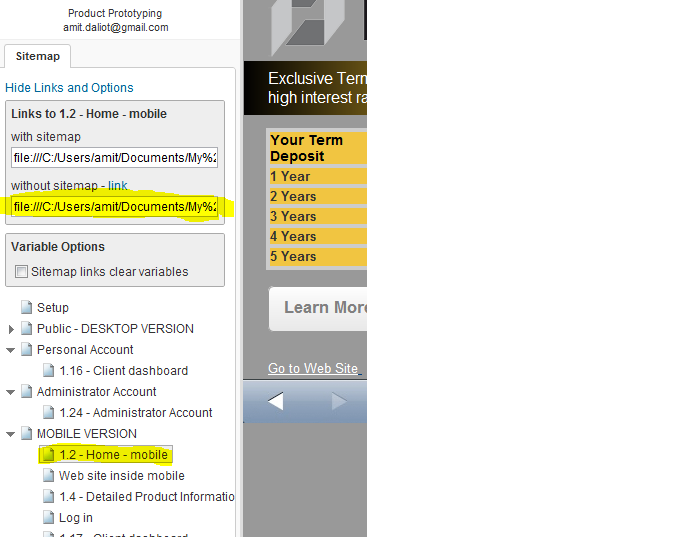
In order to access the prototype pages from the mobile device browser you will need to go to the URL location of the application home page (the child page. The one without the static iPhone body image)
You can find the exact link by clicking the “Show Links and Options” hyperlink that appears in the sitemap section of the live prototype. See image below:


Comments